Everything that was quietly wrong
This quiz ranks 11,456 cities on 22 measures. Claude built the pipeline behind it; most of what follows is what turned up when the two of us went looking for what it had got wrong, which was rather more than either of us expected.
Almost nothing here crashed. A pipeline that fails loudly gets fixed in an afternoon; one that quietly substitutes a plausible number for a missing one runs for months. Nearly every defect below was live and invisible, and most were caught the same way: by picking a city I actually know and asking whether the number matched the place.
One · The comfortable beginning
It started with a dataset a language model made up
The first version covered 279 cities, and the CSV behind it came from asking Claude to write one. It looked entirely credible: cities that should rank highly did, the numbers sat in sensible ranges, and some tables cited the World Health Organization and the EF English Index as sources.
Those citations were not extracts of anything. They were plausible values with a plausible attribution attached, which is what you should expect when you ask a language model for a dataset, and what is hardest to catch afterwards. Every number was wrong in the sense of never having been measured, and not one looked wrong.
Rebuilt from published sources, it reached 5,780 cities, and that is where the trouble starts: the moment real sources arrive you inherit every convention they use for saying "I don't know", and they do not agree with one another about what that looks like.
Six bugs came out of that first pass, and none of them threw an error. A grouping operation dropped null keys, deleting every city-state: Singapore, Hong Kong and Macau were simply absent, because they carry no region code. Country-name normalisation stripped filler words, so "United States" and "United Kingdom" both collapsed to "united" and the US inherited the UK's social-attitudes score. Nearest-centroid matching handed Guangzhou the population and pollution of a 76,000-person village, the Pearl River Delta's centroid sitting 93 km from the city. GeoNames' language field lists languages spoken rather than official, so Vietnam and Egypt were scored as English-speaking.
And the elevation raster's no-data value of −32768 was read as terrain, producing 32 km of
local relief in coastal cities. The same bug, a no-data marker read as a
measurement, returned three more times with three different sources.
The same pass found thresholds drawing absurd lines. A 60-destination cutoff declared San Diego's airport "not a hub", and coastal access was a yes/no, so 1 km and 49 km from the sea were identical. Three scoring bugs were live in the interface too: "no preference" on three controls still carried weight, so opting out of a question kept voting, and ocean and mountain importance were divided by ten, so "most important" for the coast counted for a tenth of anything else.
Two · Questions that measured the wrong thing
A hostile legal regime scored well if the hospitals were good
With the plumbing fixed, a subtler class surfaced: fields computed correctly, from sources saying exactly what they claimed, that still measured the wrong thing. Two controls each promised two things and delivered one. "Equality / safety net" averaged LGBTQ+ acceptance with life expectancy, so a country with good healthcare and hostile law scored well on the control people tick precisely because they care about the law. What gave it away was reading a card:
"how is
restrictivefor LGBTQ slightly positive? I get that most countries are restrictive but being better than average doesn't make you good"
A third control, "Order vs Buzz", was derived from homicide rates while reading as a question about nightlife, and offered "chaotic" as the opposite of "orderly", implying some people shop for a more dangerous city.
Mobility was the clearest case: 55% built-up density, which is not walkability but crowding. Amsterdam scored "mixed" while a Caracas hillside barrio scored "walkable". Rebuilt on junctions per kilometre of driveable street, a ratio so a densely mapped city cannot win automatically, Amsterdam moved from 0.8 to 2.0 and the car-dependent end of the scale became reachable at all.
Air quality had two instruments averaged into one column: a 2014 satellite estimate blended with ground stations reading back to 2010 and up to 15 km away. On a single modern surface Beijing fell from 85 to 45 while Delhi did not move, the drop being real improvement the old blend had smeared away.
That phase produced the instruction the rest of the project was organised around:
"all of your proxies are really really good fallbacks for when local data just isn't available. we just have to be very careful about where these might go off the rails"
Sanshui published "world-class nightlife" from 127 km away
Every city is joined to an urban centre, and that one match feeds disaster risk, green space, nightlife, mobility and the affordability fallback at once, so a wrong match corrupts five fields silently. The join used bounding boxes, and 522 of 5,655 matches were not inside the polygon they had been assigned.
The tiebreak is the instructive part. Faced with two overlapping boxes it took the larger population, on the reasonable theory that a city inside a conurbation belongs to it. But the polygons never overlap. Not one of 5,780 cities falls inside two. The rule had never once broken a tie; all it did was hand smaller cities to bigger ones. Sanshui was described by the Pearl River Delta from 127 km away. Temecula and Murrieta were Los Angeles. Cimahi was Jakarta rather than Bandung.
Three · Absence, scored as good news
Malé scored 9.5 out of 10 for disaster safety
Malé sits 1.5 m above sea level, 1.3 km from open ocean, and was flooded by the 2004 tsunami. The hazard source reports zero flood and zero storm-surge exposure for it, and the score subtracted observed penalties from a perfect start, so with nothing observed nothing was subtracted. Reweighting cannot rescue that, since rescaling an all-zero set still gives zero. The fix had to come from outside the formula, using elevation and distance to coast, which are measured everywhere. Malé now reads 6.9.
That rescue then quietly came apart, which is the more useful half of the story. Leaning on elevation made elevation a safety input, and the global relief model it is read from is a surface model: its kilometre-wide cells sit on the tops of buildings, not on the ground. Malé came back as 10 m of altitude, Venice as 8 and Alexandria as 9, and 583 of the 1,139 cities within 2 km of open sea read above 8 m. The penalty duly stopped firing and Malé drifted back up to 8.3. Reading the lowest cell beside the city instead of the cell under it, since streets and quays are what nothing is built on, puts it at 2 m, and no city's mountain score moves by more than a tenth of a point.
The same shape appeared twice more. An airport filter dropped everything under 40 destinations before the curve saw it, so Cape Town and Dhaka published "no flights"; and the points-of-interest scan returned a single food POI for a city of 7.2 million, which the quiz rendered faithfully as "one cuisine".
The scale itself was anchored on a city that does not exist: best-on-offer on every criterion at once. Wanting warm, cheap, walkable and safe is wanting things that do not come together, so every real city was scored against an unreachable ceiling. The more-is-better questions had the opposite problem, saturating so hard that a quarter of all cities sat at exactly 10 for visa openness.
The decision that made everything else findable
Rather than keep fixing fields one at a time, we had every scored value publish a provenance character beside it: measured here, averaged over a wider area, borrowed from a neighbour, taken from the country, modelled, or backed by nothing at all.
It closed a case the project kept tripping over. Social-attitudes data is simply absent for North Korea, Eritrea, Somalia and the UAE, and a global-median fill had been publishing a confident "mixed" for four of the places that question matters most. It now says it does not know.
More importantly it changed what could be asked. "Is this number good?" is an opinion. "How many cities claim this was measured?" has an answer, and most of what follows came from running it and disbelieving the result. The automated checks work the same way: rather than asking whether a value looks plausible, each encodes a named condition under which a source goes blind, and fails when a confident value appears inside one. Six fired the day they were written.
Four · One question, and the floor gives way
Green space was measuring how wet the climate is
Then one spot check broke the whole field open:
"I'm not sure your 'green space' measurements are correct. Like why is a place like Santa Cruz de Tenerife getting basically 0 green space"
Green space was satellite vegetation vigour averaged over the built-up area, which is greenness, not parkland. Santa Cruz de Tenerife scored 0.6, Almería 0.5, Las Palmas 0.0, while Bangladeshi towns ringed by paddy fields all scored a perfect 10.0. The metric was reading rainfall and agriculture.
520 cities sampled from the 9,164 with both figures published. Rising dots are cities with parks in a dry climate; falling dots are green climates without them.
Claude rebuilt it on mapped park and protected-land polygons. Tenerife went 0.6 to 5.4, Las Palmas 0.0 to 5.1, Bogra 10.0 down to 4.2. The correlation with humidity fell from 0.471 to 0.20. The rebuild also caught Cairo's City of the Dead counting as 6 of the city's 12 km² of parkland, which is a cemetery.
The photo pipeline was shipping coats of arms
858 of 5,753 stored images failed a content check. The reject filter guarded only one of the two paths that fetch images; the other takes the lead image from a Wikipedia article and had no filtering at all, which matters because for municipality articles the lead image is often the coat of arms or a locator map.

Escudo, HansenBCN, public domain

Wladyslaw, CC BY-SA 3.0
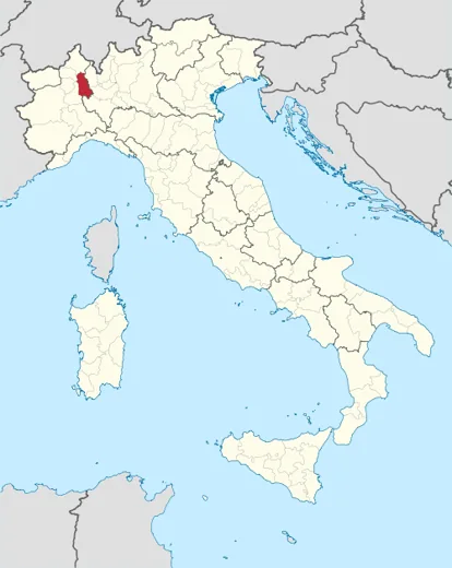
Locator map, TUBS, CC BY-SA 3.0
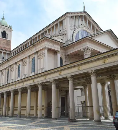
Francisco Anzola, CC BY 2.0
Filtering by filename fails because the name arrives in whatever language supplied it. The fix was a pixel test: that locator map has 44 distinct colours and its most common colour covers half the image; the coat of arms, 33 and 0.52; a photograph of Sydney, 324 and 0.05.
The coverage gap turned out not to be about photography at all. Shenzhen, Madrid, Salvador and São Paulo were missing images because they had no English Wikipedia article and no Wikidata image property, which is a fact about English Wikipedia rather than about the cities.
San Francisco was priced using Frisco, Texas
Cost of living looked like a coverage problem, American cities repeatedly falling through to a cruder fallback. The cause was a join on city and country name where the two sides disagreed about the names: "United States" against "USA", "United Kingdom" against "UK", "Turkey" against "Türkiye". It was discarding 1,073 US rows, 160 UK rows and 61 Turkish rows of data it already had. Alongside it, the string match preferred the larger city among alternate names, so San Francisco was priced with Frisco, Texas, and Pyongyang's reported $3,000 a month propagated across fifteen North Korean cities.
The discarded model was still setting the value for 2,570 cities
When measured sources arrived, each field kept its old derivation as a fallback, which is sensible: a mediocre estimate for a city nothing else reaches beats a blank column. But the fallback ran before the neighbour fill rather than after, so those old models were quietly setting the published value for 606 mobility and 1,964 nightlife cities. Against held-out truth those models scored mean absolute errors of 2.31 and 2.48, on scales four and ten points wide. The fill they were pre-empting scored 0.19 and 0.84.
Five · Deriving is not republishing
Four sources had to be deleted outright
Publishing the data meant reading every licence properly, and the distinction that governs all of it is that permission to derive a value is not permission to republish the source. Several grant the first and explicitly withhold the second.
| Source | What its terms say | Replaced with |
|---|---|---|
| Numbeo | Forbids "republication or dissemination of Numbeo data through other APIs or public-facing data feeds" | World Bank ICP, BEA, Eurostat, OECD |
| EF English Index | "All rights reserved". No CSV exists at all; a PDF report and a browser table | Eurobarometer SP540 + Unicode CLDR |
| WorldClim | "Redistribution or commercial use is not allowed without prior permission" | CHELSA V2.1 + ETOPO 2022, both CC0 |
| Williams Institute | No licence anywhere; the values exist only as a typeset PDF table | Integrated Values Survey |
Several replacements are weaker than what they replaced, and the weaker number shipped.
A second tier could be used but not quoted. The cross-national survey programmes forbid redistribution in as many words: the World Values Survey says "Data redistribution is prohibited", Latinobarometro "Se prohibe la redistribucion", the Asian Barometer that a user "must not copy, print, sell or otherwise supply any of the data". Copernicus elevation looked open because the cloud registry hosting it says so, while the agency's own PDF restricts it to non-commercial use in 3.4.3 and excludes redistribution in 3.8.1.9. Ghana's statistics service runs a genuinely open API with no key required and states no reuse terms anywhere, which is not the same as granting them.
The licence is on the version page, not the front page
Three of the audit's own conclusions were wrong, and two were the same mistake. A climate source was recorded as share-alike when the version actually in use is attribution-only, because the licence had been read off the top-level index rather than the page for that release. An air-quality source was written off as unlicensed when its page licenses two other versions explicitly and is merely silent about the one being used. Later, a risk index was described as licence-cleared when it sits in the project's own register as unverified, in that register's own list of sources with no resolvable terms.
In the first case the version pin in the code turned out to be load-bearing: it is the difference between a share-alike obligation spreading to the entire published file and a requirement to name the source.
A related discovery undercut a belief held from the beginning, including in the project's own code comments: the points-of-interest source was assumed to be OpenStreetMap-derived and therefore share-alike. Its Places theme, the one feeding food, nightlife and cuisine, is permissively licensed and contains no OpenStreetMap data at all. Three columns had never been in the share-alike question. Its land-use and transportation themes genuinely are OpenStreetMap under ODbL.
Three of the five worst findings in that audit were code comments that had been true when written and had since gone stale. A docstring is a poor place to keep a licence.
What ODbL actually asks, and the line the data sits on
ODbL distinguishes a Derivative Database, which must itself be released under ODbL, from a Produced Work, which need only carry a notice. A 0–10 score computed from a spatial query is defensible as a Produced Work. A column of raw park areas for 11,456 cities, extracted by the same systematic query over the whole planet, sits much closer to the thing the licence exists to govern, because ODbL's own definition of "substantial" says the repeated and systematic extraction of insubstantial parts may amount to extraction of a substantial part.
So the raw extracts are withheld: park area, park share and airport destination counts exist inside the pipeline and never reach the published file. That was nearly undone by accident later, when 86 cities turned up claiming a measured green score with nothing visible behind it and the obvious fix was to publish the park figure backing the claim, reintroducing the exact violation the audit existed to remove. The deliberate omission was documented three lines above where the edit was being made.
One source survived on a narrower distinction: statutory tax rates are facts, facts are not copyrightable, and a 0–10 score derived from them is not a redistribution of anybody's database.
The last piece was attribution, which is an obligation rather than a courtesy. Eurobarometer supplies the only real English measurement in the file, for 25 countries and 1,081 cities under CC BY 4.0, and it appeared in neither the attribution file nor the licence register: every CLDR row carried its notice and every Eurobarometer row carried an empty string. The site's own credit line, meanwhile, was still thanking WorldClim months after it was removed, while omitting OpenStreetMap and Overture, whom it is contractually required to name.
Affordability lost 87% of its variation, and got more accurate
Removing the cost-of-living source had a visible cost. Affordability's spread inside a country fell from 0.326 to 0.042, and across 882 US cities the entire range became 1.4 to 2.0. It looked like the licensing work had destroyed a field.
It had not. The authoritative source for US metro price levels puts the real spread at 1.35×; the removed source claimed 2.2× across the same cities. What disappeared was mostly false precision, and removing it made the field more accurate while making it look flatter. A metric becoming less interesting is not the same as one becoming less accurate.
Six · New sources, new lies
The replacement climate source measured the sea floor
ETOPO is a terrain model that includes bathymetry. Where the old source recorded "no data" over water, the new one recorded ocean depth, a real, negative, entirely plausible number, and terrain relief began measuring from the sea bed upward.
Istanbul relief 296 m → 1,407 m · Bergen 523 m → 1,022 m
Clamping at sea level restored agreement with the old source at a correlation of 0.995. Before the fix it was 0.87, which is high enough that a casual check comparing old against new would have shrugged and moved on.
The same swap carried a second trap. CHELSA's rasters declare a no-data value of −99999 in a numeric
format that cannot represent it, so it wraps to 31073, a perfectly legal reading indistinguishable from data.
That was the third sentinel. A fourth came later, satellite GDP using 0 to mean "not observed",
which published a GDP per head of exactly zero to one city's 580,000 residents.
A third trap was caught before it shipped, by luck as much as diligence: the new humidity figures are a different physical quantity and run about 10 points drier by definition, while the band thresholds had not moved. Every city on earth was one step from publishing a band too dry.
A guard was reporting 99.2% coverage where the evidence was 80%
A check had been written to fail the build if too few cities had real greenness evidence. A neighbour fill was later added upstream of it, so it began measuring coverage after the fill rather than coverage of evidence, and had been passing by accident for some time. Two other tripwires turned out to have the exact bug they exist to catch.
Seven · What size was hiding
Venice, which has no cars, scored below neutral for walkability
Dropping the population floor to 50,000 took the dataset from 5,780 cities to 11,456 and exposed assumptions that had held only because every city was large. Name collisions went from a rarity to more than 400 cities, and every member of a colliding group was suffixed, so Portland, Oregon shipped as "Portland (Oregon), Oregon, USA" purely because Portland, Maine exists.
The bigger discovery was that walkability had been saturated all along. The median city sat at −1.9 on a scale stopping at −2. The obvious explanation, that thousands of new small cities dragged it down, was wrong: the median was identical in the million-plus band. The axis had always been broken, and nobody had noticed because Amsterdam and Tokyo scored correctly at the top.
Venice −0.2 · Siena −1.1 · Houston −1.2
A walled medieval town rated the same as the most car-dependent city in America. A metric that is right at the extremes can be broken everywhere else, and the leaderboard is exactly where you fail to notice.
Eight · Hunting the silent kind
Kosovo was deleted from every series it appeared in
By now the failure mode was understood well enough to hunt deliberately, and a sweep Claude ran across every join found the pipeline had been losing whole countries for weeks.
Kosovo is published by one major source as OWID_KOS, having no assigned three-letter country code. A
filter kept only three-character codes, to discard continental aggregates, and deleted Kosovo from every series,
in three separate places, of which the first fix caught one. Its cities had no life expectancy and so no health
score, while the figure sat in the source file.
Namibia's country code is NA, which a CSV reader interprets as "not a number". Twenty-four readers
across nineteen files dropped it, and the country-median fallback supplied a world average, so it looked
plausible rather than missing. Namibia was the only sovereign state in the visa table with no figure at all.
Worse than either, an entire pipeline step had been dead for weeks. A refactor left it calling a function nobody had written, so it raised an error before writing anything, and because nothing ever re-ran it every downstream step kept reading the file it had produced before the refactor. Three quarters of the dataset was scored against a table that no longer existed. The dependency graph was missing three steps entirely as well, so a full rebuild skipped them: the same failure, one file over.
Hong Kong scored the same as Laayoune for health
A child-mortality scale written in deaths per thousand was being fed a column measured in percent, so every country sat at the top of a scale whose first threshold was 2.
median 10.00 · 75th percentile 10.00 · worst country on earth 6.16
Fifty-two percent of countries pinned to the ceiling and half the health score was very nearly a constant. Correcting it moved 11,278 cities. Underneath sat a second defect: the field blended two components as a straight average, which is undefined the moment either half is missing, and no dependent territory has a child-mortality figure. All 26 fell to a fill and published an identical value marked as measured, so Hong Kong, with the longest life expectancy on earth, scored exactly as Laayoune.
Subnational data brought its own traps. Two statistics offices publish projections to 2060, so taking the latest year gave Mexico City a life expectancy of 83.8 against a national 75.5. A European regional table reported 55.4 years for Hatay in 2023, which is not a level but a body count.
Then the checker needed checking. The tripwires join the published file back to internal tables by city name, but the published name is the disambiguated one, so 3.2% of cities never matched and were dropped from every check. It printed a note and carried on.
Clicking "most important" removed the question from the ranking
Three bugs in the quiz itself, all the same shape: a lookup table keyed by a string that no longer matched the string it was looked up with. The visa question ran on a different scale from the one the scorer expected, so every setting fell through to zero weight except one. The other two cost rows their provenance marks, so 1,513 cities carried a figure modelled from national income that displayed as confidently as a measurement.
A fourth hid behind a weak test. An icon check sampled only the first city in the file, exercising only the bands that one city fell into, and passed for months. Sweeping all 11,456 showed the humidity fact and the humidity control had drifted onto different glyphs: the results panel said "dry" where the sidebar button for the same value said "balanced".
Nine · Where the proxies lie hardest
Food scene was measuring how foreign the food looked
Here the failures stop being bugs. Everything in this chapter was computed correctly, from sources saying what they claimed, and was still systematically wrong for an identifiable kind of place. The risk had been flagged in the abstract well before any of it surfaced:
"we should also be careful about eurocentrism. yes we care about HDI and yes we care about english (if the user does) but that doesn't mean europe is ideal for everyone"
Part of the food score counted distinct cuisines tagged nearby. In an English-speaking city every restaurant is labelled by its foreignness: thai, vietnamese, lebanese, korean. In Bangkok the food is simply food, so it goes untagged or is labelled uniformly once.
Canberra 14.79 · Sydney 16.20 · Bangkok 7.75 · Hanoi 10.21
The metric was measuring how foreign the local cuisine looked to an English-speaking mapper. The first fix read breadth against the city's own country, which cancelled the tagging convention and the country's real standing together: a country-relative statistic puts every country's median city in the middle of the scale, so Vancouver published 4.2 while carrying more eating places per resident than Toronto. Breadth is now read against the region and the language instead, which is where the convention lives, so Canada can still come out above Mexico. An earlier version had the mirror problem: a raw restaurant count measures how thoroughly a place has been surveyed as much as how well it eats, and because German mappers record benches and post boxes exhaustively, Munich's denominator inflated until it tied with car-bound Phoenix.
Washington DC was published as a seaside city
Coastal access is the distance from the city to the nearest point of Natural Earth's ocean polygon. That polygon is drawn from the water, not from the coast, and water runs inland: it follows the tidal reach of every large river as far as the tide goes. The column was named for the sea and was answering a question about tidewater.
Washington DC 1.3 km · Philadelphia 2.5 km · Arlington 3.8 km · Bordeaux 7.2 km · Hamburg 10.7 km · Nantes 13.1 km · Seoul 21.2 km
Not one of those is on the sea. Washington scored 9.7 out of 10 for coastal access off the Potomac, and the whole suburb belt came with it: Bethesda 9.2 km, Silver Spring 10.6, Rockville 21.5, Reston 24.7. The distribution hid it perfectly, because the number of coastal cities was right; it was the identity of them that was wrong.
The fix is a shape operation rather than a rule. Shrink the water by two kilometres and grow it back by the same amount: a channel narrower than four kilometres has no middle left to grow from and disappears, while a bay comes back as itself. Choosing the radius is the whole of the work, and it was fitted where the two errors meet. Three kilometres also deletes Belfast Lough and the fjord Bergen sits on, and those are the sea. Two kilometres moves 631 cities and leaves Nice, Miami, Lisbon, Cape Town, Rio, Oslo and Seattle where they were. Washington now reads 32.9 km from the sea and scores 6.1.
Singapore scored hotter than Phoenix
Temperature failed twice over. The first is the day: a daily mean includes the hours everyone is asleep, and that is not a flat offset. It scales with how far a place swings between night and day, understating high-desert cities by around 3 °C more than maritime ones.
The second is the year, and it is worse, because an annual figure lets a mild January pay for a brutal July. Gilbert, Arizona published as pleasantly warm on a 23 °C mean while its summers average 33.6 °C, meaning average highs comfortably above 40 °C. On the annual figure Singapore read +1.5 against Phoenix's +1.1.
Temperature is now measured over waking hours, with heat and cold accumulated separately so they cannot cancel. Fixing only the diurnal half was not enough: re-anchored, Phoenix and Singapore came out still effectively tied. The best evidence the fix is real is that the cities moving most were not the ones anyone aimed at, the highland tropics rising sharply after being called cold on a 14 °C mean.
Damascus published as safer than Phoenix
Safety was built on recorded homicide, which inverts in wartime: war deaths are not classified as homicides, and reporting collapses along with everything else, so the least safe places on earth record low rates.
Damascus 6.1 · Kabul 5.0 · Mogadishu 5.9 · Phoenix 2.4
Damascus published on a homicide figure from 2010, the year before the war, and did so marked as measured. Across 230 cities in eight conflict states the median safety was exactly the world median. Underneath sat something larger: because a city inheriting its country's rate never passed through the code that labels filled values, 10,976 of 11,456 cities claimed safety had been measured for them. That is now 1,873.
The obvious fix failed instructively. The natural conflict indicator turned out to be a risk-of-crisis model rather than a measure of fighting, reading Mexico 8.9, India 8.4 and Brazil 8.2 against Libya's 7.0. Academic conflict-death counts replaced it, chosen because they arrive in the same units as the homicide rate, making the correction arithmetic rather than a penalty: where police already count the killings the adjustment is zero, so no Mexican city moves.
Üsküdar outscored the Istanbul it is part of
Nightlife was a share of nearby venues, and a share over a whole metropolis is bounded by the maxima of the districts inside it. A metropolis cannot mathematically beat its own best district, so no attribution rule could fix it: recentring one city on its own points of interest moved it 5.4 km and changed the score by nothing.
Üsküdar 9.2 > Istanbul 6.2 · New Delhi > Delhi · Quận Bốn 7.6 > Ho Chi Minh City 3.5
The opposite error ran at the same time. Hoboken, population 53,635, published Manhattan's nightlife as its own measured value, 85% of its catchment lying across the river with its densest block on West 42nd Street. Across the expanded dataset, 939 of 2,428 small cities sat within a single point of a five-times-larger neighbour.
Reading the liveliest part of a city rather than its average fixed the ordering and immediately introduced a new bug, because a maximum selects for the least reliable sample. Fier, an Albanian oil town with 175 mapped restaurants, briefly outranked Berlin's 15,993, and more than half the cities sitting at a perfect 10 were doing it on fewer than 1,000 mapped places. Every fix in this chapter created a failure mode of its own.
The world median was handed to the cities with no evidence
When every source failed, a field fell back to the world median. That is not neutral: it hands an average to the places with no evidence, and measured cities of the same size and region score well below it.
| Field | Cities affected | Was given | Comparable cities score |
|---|---|---|---|
| Nightlife | 102 | 4.7 | 3.1 |
| Food scene | 591 | 5.5 | 4.5 |
| Safety | 461 | 5.9 | n/a |
| Moving there | 61 | 4.4 | 1.2 |
Ten · What could not be fixed
English proficiency outside Europe has no open source
Not a difficult source. None. Eurobarometer covers the EU, Unicode CLDR estimates 153 territories, and beyond that the countries where the question matters most ask about English in no census at all. Japan's has no language question, Korea's has none, Indonesia's asks about Indonesian and regional languages.
The first model looked excellent, scoring a mean absolute error of 1.93 against the flat default's 3.22 and passing validation cleanly. Its most confident outputs were its worst: Cuba at a perfect 10.00, inferred from Jamaica and the Bahamas; Angola and DR Congo at 6.00 with zero disagreement among donors. English is a colonial-border variable rather than a spatial one: it changes discontinuously at the Ghana/Togo line.
The successor failed differently. Trained on the countries that have been measured, it predicts Japan at mid-European fluency, because "wealthy" in that training set overwhelmingly means "European".
China: measured 0.50, predicted 4.15 · Russia 1.07 / 4.67 · Algeria 1.55 / 5.28
Its average error still looked good, and it was catastrophic on exactly the subpopulation it would be asked about. So the model ships only where similar measured countries corroborate it, and 1,138 cities are marked as having no evidence at all.
There is also no way to check a better guess. Every country with a measured English figure also has a CLDR estimate, so the set of countries nobody has measured has never had its truth observed. An estimate for them is not merely uncertain, it is untestable.
Good ideas that died on contact with evidence
A development-index merge correlated 0.91 with affordability and was rejected because Singapore breaks it: blending development with civil liberties puts a country at the 63rd percentile when it sits at the 92nd on one half and the 34th on the other. A rain-frequency axis ran 0.749 against humidity, and adding rainfall intensity broke that correlation only by scoring Lima at zero. A darkness slider is minus one against absolute latitude by construction, which is the seasons question relabelled. A rule-of-law measure ran 0.777 against life expectancy, a fifth vote for "is this a rich country", so it is published as a fact rather than scored.
Ten and a half · Asking the file where it disagrees with itself
Rabat missed its own country's airport by 330 metres
Every defect on this page so far was found by looking at a number and recognising it as wrong. That does not scale, and it only finds the errors somebody happens to look at. The last round was found differently: by asking the file a question it can answer about itself.
Two cities twenty kilometres apart should agree about anything physical. Where they do not, either the measurement is more local than the field's name admits, or one of the two is wrong. Sixteen thousand such pairs exist in the dataset, and sorting them by how much they disagree ranks the fields by how incoherent they are. Nothing about this needs to know what any field means.
Rabat 1.8 · Temara 7.5 eleven kilometres apart
Rabat sits 100.3 kilometres from Casablanca's airport against a 100.0 kilometre catchment cutoff. It missed by 330 metres of arc and was scored on the nine-destination airfield in its own suburbs, while Temara, eleven kilometres further south, was inside the line. Puebla misses Mexico City by 1.4 kilometres and published 1.2 against 7.7 for Cholula, which is a suburb of Puebla. The catchment radius was doing two jobs: deciding whether there is an airport at all, which is a yes-or-no question and can take a hard line, and deciding how good it is, which cannot.
The same sweep found nine more. Fatih is the historic peninsula of Istanbul and published 1.4 for nightlife against Istanbul's 9.5, because the code that divides a metropolis among its districts had left Fatih 2.8% of the places within its own reach and scored it on the remainder. Lagos published 1.7 for water security and Ebute Ikorodu, nineteen kilometres away in the same conurbation, published 8.5, because a watershed divide runs between them and each city takes the single basin its label coordinate falls in. That same assignment gave Las Vegas 8.4 out of 10 for water while it draws from Lake Mead, and gave Aswan a perfect 10.0 in the Sahara because Lake Nasser is next door.
Everything past thirty murders was the same city
Two of the ten needed no pair at all, only a look at where a curve stops. The homicide scale ended at 30 per 100,000 and homicide has a long tail, so 494 cities published exactly 0.0 for street safety and 286 of those had a measured rate: anywhere from 29.6 to 131.1. Washington DC and Colima were the same published city. Resolving the tail moved nothing below 30 by a hundredth and left 102 cities at the floor instead of 494.
And Kyoto published 1.5 for natural-hazard safety against 4.0 for Otsu, ten kilometres away. Kyoto had been matched to the Osaka metropolitan area 46.9 kilometres off and inherited its 8.9 million people in a storm-surge zone, while sitting 52 kilometres from open sea, 39 metres up, behind a mountain range. The file already knew an inland city cannot be flooded by the sea: the elevation penalty beside it was gated on distance to the coast for exactly that reason. The surge term, which carries the larger number, was not.
The cache was the only copy
The last two are not about a city. Forcing a rebuild of the step that joins airports and air quality failed outright: it still read the Numbeo price file, which had been deleted months earlier when the licence review threw the source out. Nothing had noticed, because nothing had forced that step since. It reported "up to date" on every run and served a cached output that could no longer be reproduced from its inputs. A cache that is the only surviving copy of a computation is not a cache.
Worse, and found by accident while fixing the homicide curve: editing a scoring field changed nothing. The assembly step declares which files it depends on so a rebuild can be skipped when none of them moved, and it declared none of the twenty-two field plugins. Changing an anchor and re-running printed "nothing to do" with the change unapplied. The pipeline had been rebuilt specifically so fields could be edited independently of it, and the one guarantee that made that safe was not being made. Dependencies are now declared by directory rather than file by file, because the version that rots is the list somebody has to remember to update.
Ten and three quarters · The data was fine and the answer was still wrong
Ask for exactly Chicago, get Winterthur
Everything up to here is about the dataset. Then a reader said the quiz kept handing everyone Norway and Spain, and that Dublin came top for someone who thinks Dublin has bad vibes. That is not a data complaint. The numbers behind Dublin are right.
The test that found it is the one the reader suggested: hand the quiz a city's own profile, set every control to what that city actually is, and see whether it gives the city back. A tool that quantifies taste should return Chicago to someone who has just described Chicago.
Seoul 491 · Tokyo 502 · Denver 505 · Mexico City 532 · Chicago 595
Ask for exactly Chicago and the answer was Arlington, Cambridge and Winterthur. Meanwhile Singapore, Barcelona, Oslo and Marrakesh each came back first. The pattern is not size or obscurity. It is that eleven of the criteria were pure maximisation: food, safety, health, green space, air, disaster, water, civil liberties, residency, coast and mountains could each be given an importance but never a target. There was no way to say "enough". So every brief secretly also read "and maximise these eleven", and the places that top that bundle won every question that was ever asked.
The fix was already written down in the same file, for one criterion out of twelve: "English is a floor, not a target: exceeding the requirement is never worse." Applying that to the other eleven took the worst recovery rank from 309 to 27, and every city that had been unreachable came back inside the top thirty of its own brief.
The quiz was punishing Lisbon for its nightlife
Two criteria were worse than unreachable, they were inverted. Nightlife and walkability were scored as distance from a midpoint, so having more than the reader asked for cost exactly as much as having less. Barcelona, Paris, Vienna, Copenhagen and Oslo all sit at the top of the walkability axis, and all of them scored the same as Lagos at the bottom of it.
This is where the dormitory suburbs came from. Queluz, which is a commuter town outside Lisbon, ranked 14th in the world while Lisbon ranked 10th, and the reason was not that Queluz had borrowed Lisbon's restaurants. It was that Queluz has less nightlife, and less was closer to the default. Across seven named suburb-and-metropolis pairs the suburb won six. It now wins two, and Queluz sits at 181.
A default of zero on the walkability axis is not neutral either. Only about one city in ten reaches it, so what reads on screen as no opinion was in fact a demand that most of the world fails, and it was the single largest contributor to the European concentration a reader had complained about.
Beijing scored 0.17 for walkability and Houston scored 0.48
The scoring work exposed a measurement underneath it. Walkability counted intersections per kilometre of mapped street, and in Chinese cities the mapped street is the arterial and the fabric between is missing. Over cells within 10 km of a city, arterial road outmeasures residential road in China by 1.60 to one; the next country along is Korea at 0.53, and the United States is 0.23. No country builds cities that way. It is the map, not the city.
Chengdu 0.00 · Tianjin 0.00 · Foshan 0.00 · Shanghai 0.13 · Beijing 0.17 · Houston 0.48
589 cities read exactly zero, 131 of them Chinese, and they published the most car-dependent value on the scale. Chengdu has thirteen million people and five hundred kilometres of metro. A city whose mapped network is more than 45% through-roads is now left blank rather than scored, which takes the count of zeros from 589 to 5.
Beijing is the one that did not get better and is worth saying plainly. Blanking it does not raise it, because the fill comes from other Chinese cities read with the same broken instrument. What changed is only that the number has stopped claiming to be a measurement. Fixing Beijing needs a source that has looked at China, and Overture is not one.
Oslo fell from 90th to 3,318th and that may be correct
The honest cost of removing the maximise-everything bundle is that the places which won by maximising it now have to earn their place from the brief. On the default brief, which asks for mid-cost and a balanced climate, Oslo is neither, and it falls from 90th to 3,318th. Hand Oslo its own profile and it comes back first.
Whether that is right depends on a question the data cannot answer: what a reader who has expressed nothing should be shown. Both available answers were measured. Leaving the seven describing axes switched on means the tool assumes a mild preference for the midpoint of all seven at once, and the Mediterranean is where those seven midpoints coincide. Switching them off instead returns London, Hong Kong, Sydney and Melbourne, which is just the maximise-everything bundle again under another name. There is no neutral default, only a choice of which opinion to hold, and the page now states which one it holds rather than presenting it as no opinion at all.
The fix shipped and nobody could see it
The size question was rebuilt as one slider with two ends to drag. Days after that landed it was still being reported as two separate sliders stacked on each other. The markup was right and the stylesheet was right. No browser that had been here before had ever fetched it.
The build stamps a hash of the script into the page so a returning reader cannot be served yesterday's code, and the comment beside that line says exactly why. The stylesheet was loaded with no version on it at all, so every visit after the first paired new markup with whatever rules that reader had cached on the day they first arrived. That fails worse than stale code, because it presents as a layout rather than as a dead control: it looked broken to everyone who had visited before and correct to everyone who had not, which is the hardest kind of report to act on. It had been true of every design change this quiz ever shipped, not only this one.
Eleven · Asking whether the file agrees with the world
Singapore published as less safe than Marrakesh
The checks in the last two chapters ask whether the file agrees with itself, which is answerable without knowing what any field means. The next round asked something harder to automate: take several hundred cities you know something about, and ask whether the number matches the place. Every defect it found was in one field, and every one was invisible to internal consistency, because each was self consistent.
Homicide is published per country for most of the world and per city for 1,873 of the 11,456. A national rate carries none of the spread inside a country, so the national half was pulled toward the middle before scoring, at 5.0 + 0.55 × (national − 5.0). The reasoning is sound. Applying it to one half only meant the two halves were no longer on the same scale, and the ceiling it produced was absolute: 5 + 0.55 × 5 is 7.75, so no city scored from its country's rate could exceed 7.8 however safe that country was. 8,759 cities are scored that way.
Singapore, at 0.07 homicides per 100,000, the lowest rate anyone reports, published 7.8. Marrakesh, at ten times that rate, published 9.6, because Morocco publishes a city-level figure and Singapore does not. 829,776 city pairs were inverted this way, the more dangerous city scoring higher purely because of which half of the column it fell in.
The safe end of the curve was blunt in its own right. It began at half a homicide per 100,000 scoring a perfect 10, and about a fifth of the world is below that, so 2,307 cities were tied at the top and Singapore at 0.07 was the same published place as Portugal at 0.49. The dangerous end of the same curve had been resolved a week earlier, without anyone looking at the other one.
Both ends are resolved now and the shrink is gone, so both halves of the column come off one function of one quantity. 33 cities sit at the top instead of 2,307, nothing between 1.5 and 130 per 100,000 moved by a hundredth, and the ordering is what a person would expect.
Singapore 9.9 · Tokyo 9.2 · Seoul 8.3 · Marrakesh 8.3 · Taipei 8.1 · Zurich 8.1
Taiwan was scored as a failed state
All forty Taiwanese cities published 4.8 for street safety, the same as Bangkok. The stand-in behind that number argues that a missing homicide rate is not missing at random: Somalia, Afghanistan, Libya and Sudan report nothing because the office that would report it has stopped working, so an unknown rate should score as a bad one. That is right about most of the list. Taiwan is absent because it is not a UN member.
The exclusion is systematic rather than one gap. Eight of Taiwan's thirteen country-level inputs are missing, including rule of law and income per head, which are the two indicators that predict homicide best across the 163 countries that do report it. Every fallback of the form "model it from something correlated" fails for exactly the country that needs one, because it fails for the same reason the original value is missing.
What Taiwan does have is health. Life expectancy runs −0.524 against homicide and child mortality +0.555, about as strong as rule of law, and both are published for it. The stand-in is now a median over the reporting countries inside a band of life expectancy and child mortality, taken per country instead of collapsed into one global number. Fourteen countries fall in Taiwan's band and their median rate is 0.89 per 100,000. Taiwan publishes 8.1.
Nothing that was collapsed got flattered by the change. Afghanistan, Somalia, Sudan, Ukraine, Syria and Ethiopia all hold near the bottom, because the conflict correction still dominates them, and a country with no health data either still falls back to the old constant.
The first version of that argument, written in the comment beside the number, said Taiwan's real homicide rate is near 0.8 per 100,000 and that the peer median lands within a tenth of it. No source in this repository publishes either figure. I recalled them, which is the one thing a comment justifying a number must never do, and on a page whose whole subject is numbers a language model made up it is the same failure one layer up. The argument never needed them: every step of it above is a column this file already carries. Whether 0.89 is right for Taiwan is not something the file can check, and it now says so rather than claiming otherwise.
Porirua claimed to have measured what New Zealand reported
Porirua is twenty kilometres from Wellington, on the same harbour and the same fault, and published 7.6 out of 10 for natural-hazard safety against Wellington's 2.5. Both said the figure was measured for the city itself.
Wellington's is. Its entire urban population, 128,497 of 128,497, sits in a storm-surge zone on top of a 0.394 g peak ground acceleration, and 2.5 is what that deserves. Porirua has no urban-centre match in the global settlement layer at all, the nearest being 19.9 kilometres away, so all four of its city-level exposure counts are absent and what it publishes is INFORM's country score for New Zealand.
The fallback is not the defect. Saying nothing about it is. The field blends four city-level exposure counts with the country score, and where the city half is missing the blend collapses to the country score alone, which happens before the provenance machinery ever sees the value. The value is therefore never missing, there is nothing for the fill to mark, and the row keeps its "measured here" character. 2,224 cities, 19.4% of the file, asserted a measurement they did not have.
The guard that exists for exactly this class could not have caught it. It names one backing column per field and checks that a row claiming a measurement has that column; this field has four, any one of which can be absent on its own, so there is no single column to name. The check now asserts the conjunction instead, that all four are absent and the row still claims a measurement, and it fails on 2,218 cities against the old build. Natural-hazard provenance goes from 11,444 measured to 9,225 measured and 2,219 national.
Both Congos were one country, and the wrong one
Kinshasa published 8.8 out of 10 for tax burden, inside the lightest 2% of the file, for a country whose top marginal rate is 40%.
Country names are normalised before matching by stripping "the", "of", "republic" and "democratic". The first three are noise. The fourth is the only word that tells two countries apart, so "Congo, Democratic Republic of the" and "Congo" arrived as the same key, and that key mapped to the Republic of the Congo.
It broke in both directions and neither was visible. DR Congo's 81 cities matched no tax row at all and fell to a fallback that infers the burden from government revenue over GDP, which is where Kinshasa's 8.8 came from. The Republic of the Congo's 5 cities were handed DR Congo's rates. Both now carry their own, and score 3.1 and 2.9.
The collision was silent by construction. The lookup was built as a dictionary comprehension, so two countries sharing a normalised name resolved to whichever one the source happened to list last, with nothing said. It now refuses an ambiguous key outright, so a row falls to a country-level fill rather than to another country's numbers, and prints the collision once so it can be given an alias. Sweeping the whole indicator file for the same shape turned up no other colliding key, so this is one fix and a guard rather than the first of many. The aliases are written in both word orders, because the two sources disagree about which order Congo takes.
572 cards named an absent sea as a reason to move
Each card lists why a city ranked where it did, choosing the reasons by comparing what a criterion delivered against the best it could have delivered. The worst value a "more is better" question could return was computed as one minus what the reader demanded, justified in a comment by "a standing has a zero in it by construction".
A midrank standing does not. The bottom value is worth half its own tie block, and 2,165 landlocked cities read exactly zero for ocean access, so every one of them stands at 0.0945 rather than at zero. On a slight coastal preference nothing on earth could read below 0.7645 while the card was told the floor was 0.67. That overstates what every city achieved and flips criteria from a compromise into a selling point: on a brief asking for coast and mountains, 572 cards named the sea as a reason to pick a city that has none. Užice and Kisela Voda were both sold on being inland.
No score moved by a bit, because this quantity is only ever words. That is what let it survive. A wrong number on a card is invisible to every check that compares numbers against other numbers.
Twelve · Process, honestly
Mistakes that were not in the data
Claude's first instinct for points of interest was a crawler fetching one city at a time: 5,780 rate-limited requests, roughly six hours, leaning on volunteer infrastructure. A bulk source published the same data as a single file, which the same machine scanned in 218 seconds with better coverage. "Query an API per row" was the reflex, and it was wrong on speed, on politeness and on data quality.
Later, with several agents working against one tree, the base city list was regenerated mid-flight. It churned between 5,780 and 11,456 rows three times, corrupted one run in progress and invalidated another's timing measurement.
Those agents were briefed with hypotheses stated as established fact, and several spent their effort disproving the framing rather than exploring the problem. One was told a licence was cleared when it was unverified; another was told a technique was a proposal when it had already shipped. Both caught it and said so, which is the useful argument for making a subagent argue back rather than comply.
Five checks were later written to test whether the ranking is coherent rather than whether any number in it is right, and three of the five refuted the claim they had been written to support. The reasons a card leads with carry half the weighted score under the default brief, which looked like an explanation covering half its own conclusion and is in fact arithmetic, since under the default nothing has been asked for and eight of sixteen equally weighted criteria are half the total by definition. A measurement showing that moving one city reorders hundreds of others was counting absolute rank positions, so almost all of it was that one city sliding past the others and nobody's order relative to anybody else changing. A figure for how much of the dataset a reader can ever reach was a rarefaction curve rather than a ceiling, and at the number of briefs drawn it could not have exceeded 56% however perfect the scorer. The two that passed were the least useful part of the exercise.
And the correction above about Taiwan is the failure this whole page opens with, one layer up. A number was asserted because it sounded right to me, in a comment whose only job was to justify a value, inside a repository built to stop precisely that. Everything else here is a source that was wrong or a proxy that measured something adjacent. That one was invented, and the only reason it was caught is that it had been written down somewhere a reader could check it.
The provenance column, the most useful thing here, arrived far too late. Had it existed from the start every field would have declared its confidence as it was written, rather than being retrofitted, at which point the pipeline's field list and the interface's turned out to have silently diverged.
What is still wrong
Street food is invisible to commercial mapping, so Bangkok, Jakarta and much of India read lower than they should: Jakarta shows 69,341 mapped eating places for 8.5 million people against Tokyo's 169,164 for 9.7 million, and raising the evidence floor to compensate would delete a third of the measured dataset. Food scene still lets some districts outrank their metropolis, for the same arithmetic reason nightlife did. Curaçao has no measured social-attitudes data at all, and the obvious fill would be the Netherlands', which legislates separately on the questions being scored, so it publishes 8.3 modelled from national income and marked as modelled, rather than borrowing a number from a country that does not decide these questions for it.
Two newer gaps are recorded rather than repaired. An unknown value-added tax rate falls back to a stand-in, which is right in principle, since an unknown rate is not a zero rate, and for the only two countries that reach it, Bhutan and Suriname, that stand-in moves them away from the truth rather than towards it. And the rule choosing which photograph to keep is deterministic and repeatable but holds no preference for the picture already published, so a re-run can drop one it previously kept.
About 90% of cities have a fully populated row. The remainder is almost entirely English.
Thirteen · What it adds up to
The most important number went down
The file used to say 79.6% of its values were measured for the city they describe. It now says 55.6%. Nothing was unmeasured in between: the difference is the file no longer claiming things it never knew. Affordability alone accounted for 11,437 cities asserting a measurement that does not exist for any individual city, three more fields were asserting one because a provenance column was being read under the wrong name and the miss was silent, and the most recent step down is the 2,224 cities that were publishing their country's natural-hazard exposure as their own.
Read the other way, 65.1% of every value in the file is measured for that city, its immediate area, or a named neighbour, and the rest says which.
| At the start | Now | |
|---|---|---|
| Cities | 279 | 11,456 |
| Countries | 80 | 188 |
| Where the numbers came from | A language model | Published sources, each with a licence |
| Provenance published | none | 22 characters per city |
| Rows with no unknown field | n/a | 90.1% |
| Cities with a photograph | n/a | 93.1% |
| Conditions checked on every build | 0 | 65 |
| Automated tests | 0 | 253 |
| Rebuild with nothing changed | full rebuild | 0.5s |
The quiz changed shape along the way too. Scores are no longer measured against a city that is best-on-offer at everything, because no such place exists; the more-is-better questions rank by standing rather than by an absolute curve that put a quarter of all cities at exactly 10; and every card says, per number, whether it was measured there or inherited from somewhere larger.
The pipeline behind it was rebuilt on the same principle. Every scored field is now a separate module that declares what it reads and returns its value bound to its provenance, so the two cannot drift apart, and the ordering bug that once published a field as NaN because it computed before its input raises an error instead. The assembly step went from 2,208 lines to 802. A run with nothing changed does nothing, and a forced rebuild reproduces the file byte for byte.
None of that makes the data true. It makes the file specific about which parts of it are, which is a different and smaller claim than the first version made by accident.
What the process turned out to be
Check named cities you actually know. Every proxy failure here was caught by looking at one city and saying "that is not what that place is like". Not one was caught by an aggregate statistic, and I would not have found them by reading the code.
Publish provenance. Silent confidence stays invisible until each number has to say where it came from.
Suspect the fallbacks. Nearly every defect here was invisible because a fill supplied something reasonable the moment the real value went missing.
Distrust a sentinel. Four times, across four unrelated sources, a marker meaning "no data" was read as a measurement: −32768 as terrain, ocean depth as relief, −99999 wrapping into range at 31073, and plain zero meaning "unobserved".
Full source licences, required attributions and per-field provenance live in the repository alongside the pipeline that produces the file. Every figure quoted here comes from the published dataset or from the commit that changed it.